CS194-26 | Colorizing the Prokudin-Gorskii Collection
Allen Zeng, CS194-26-aec
Large outputs rescaled to less than 1500px height for display on website.
Premise
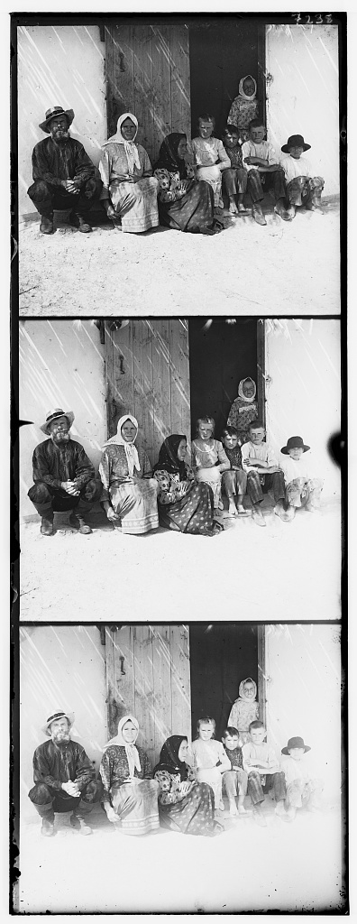
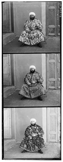
The Prokudin-Gorskii Collection features copies of glass plates, where each copy consists of three separate images that were taken with different filters. The three separate images correspond to different color channels. For this project, the top image corresponds to blue, the middle to green, and the bottom to red. The goal of this project is to automatically align the three images for the various plates using fixed parameters among all images. Meaning that parameters are chosen at the start of the algorithm, and then the same algorithm is applied to all plates.
Algorithm Overview
The skeleton of the algorithm is as follows. First, the three panel plate is separated into three separate and equally sized 2D image matrices. Each 2D matrix represents one color channel. Then the three matrices are aligned, and stacked into one final image. Different image processing techniques can be applied between those steps, which we will discuss later. The main part of this algorithm is the alignment function.
In order to measure the "alignment" of two channels, I used the Normalized Cross Correlation (NCC) metric. Images are naturally 2D matrices, but they are flattened to vector form for the following calculation. Given an image $a$ (in vector form) in one channel and an image $b$ (in vector form) in another channel
$$ncc = < \frac{a}{||a||_F} , \frac{b}{||b||_F} >$$
Where $||\cdot||_F$ is the Frobenius norm, and $<\cdot,\cdot>$ is a dot product. Higher $ncc$ values mean that $a$ and $b$ are more similar and are therefore better aligned.
With that metric in mind, the first channel is translated both vertically and horizontally in search for the best alignment with the second. And then the second channel is aligned with the third. The three channels are stacked to create the colored output image.
Algorithm In Depth
First, the three channels are obtained. Note that the original three-panel image has borders around each panel. So, 7% of each side of each channel is cropped out. This value was empirically chosen to balance border removal and keeping the image intact.
Then the Green channel is aligned to the Blue channel. And then the Red channel is aligned to the Blue channel. For the alignment, NCC was used. While aligning two channels, the assumption is made that two channels are no more than +/-15% displaced in translation, relative to the channel size. Empirically, that factor is generous in displacement. Furthermore, we only examine the inner 70% of the images (without cropping the original any further). This ensures that the plate borders and the physical blemishes of the plate edges do not affect alignment.
So the search space over channel $A$ and channel $B$ is the double for-loop over displacements [-15%, 15%] vertically and [-15%, 15%] horizontally. (This factor works well for small images, but not for large images. Image pyramids are used to optimize this part.) The translated channel $A$ that receives the best NCC score is returned, as the best alignment to channel $B$.
Once Green and Blue are aligned, and Red and Blue are aligned, the three colors are stacked into a single image. The outputs are shown below.
Image Pyramids
While searching over +/-15% displacement works for small images, it is inefficient for larger images. (For example, something over the size of 1000x1000 pixels.) To solve this inefficiency, image pyramids are implemented with a factor of 2.
Image pyramids are created for each channel. Say for channel $A$, the original image size is 2000x2000 pixels. A list of scaled-down images are produced based on that large image. In my implementation, I scale until both height and width are below 200 pixels. So for example, I would end up with a list of scaled images $$[(2000\times2000),(1000\times1000),(500\times500),(250\times250),(125\times125)].$$
This way, I can initially limit the alignment search space to the smallest image. The search becomes much faster. After the alignment is found for the smallest image, we search again in the image one step larger. In the one-step-larger search, we can do a rough alignment given by $2 \times $(the previous image's alignment). Note that pyramid has a scale factor of 2. Also, note that due to the rough alignment and the factor of 2, this current roughly aligned image is at most +/-2 pixels away from the optimal alignment to channel $B$ at this level. So at the current level, the search space can be limited to +/-2 pixels in each direction. (Just to be safe, I set the search space to +/-3 pixels. But empirically, all relative displacements are actually within [-2,2] pixels. Except for the Emir picture.)
After recursively finding the image alignments in the pyramid, the original image is efficiently aligned. This is much better than naively searching over [-15%, 15%] of 2000 pixels: 600x600 pixel search space.
Again, after alignment, the large original channels are stacked to create the output image.
Results
The above algorithm worked well in almost every image. In the original 13 staff-provided images, only the Emir image failed to align well.
And in the 3 additional images downloaded from the Library of Congress, all 3 aligned well.
(Plaque, House, and Closet).
I suspect Emir did not align well due to two reasons: First, the input channels have very different luminances. The bottom channel (Red) is relatively brighter than the others. And second, his clothing is very colorful and textured. In the grayscale top channel (Green), his clothing is white with black plants. In the grayscale middle (Blue), his clothing is overall gray. In the grayscale bottom (Red), his clothing is dark with white plants. This causes NCC to break down as a metric, as it prefers to align whites with whites and blacks with blacks.
Average runtime per image is less than 20 seconds. Total runtime is about 245.03612 seconds, or about 4 minutes for 16 images.
Under the assumption Prokudin-Gorskii used pure RGB filters, the RGB output images in the original algorithm has strong yellows and sepia tones. This suggests that while the RGB assumption is decent, Prokudin-Gorskii did not actually have pure RGB filters. Still overall, the images produced by this algorithm turned out pretty well.
Aligned Images (Images Clickable)
All translational displacements are relative to Blue channel (top image). All of these displacements are in terms of absolute translation in pixels (not relative per level).
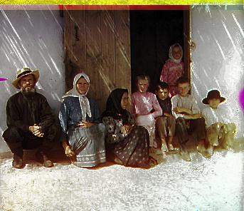
* small input images run on single-scale search (no pyramid processing necessary)
Key: channel[Vertical pixels, Horizontal pixels]
* Cathedral
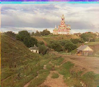
Runtime: 0.4774 secs |
Emir
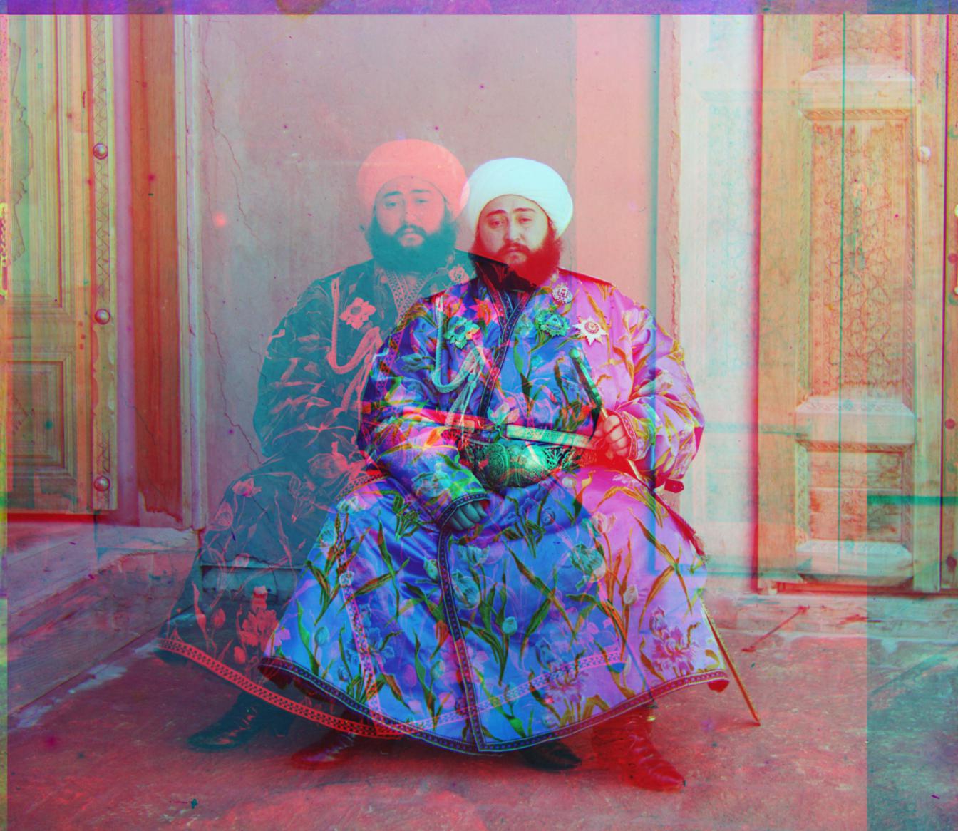
Runtime: 22.2336 secs |
Harvesters
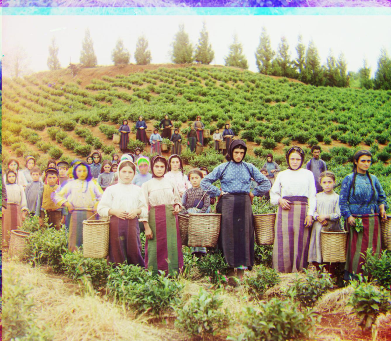
Runtime: 20.4103 secs |
Icon
Runtime: 21.7114 secs |
Lady
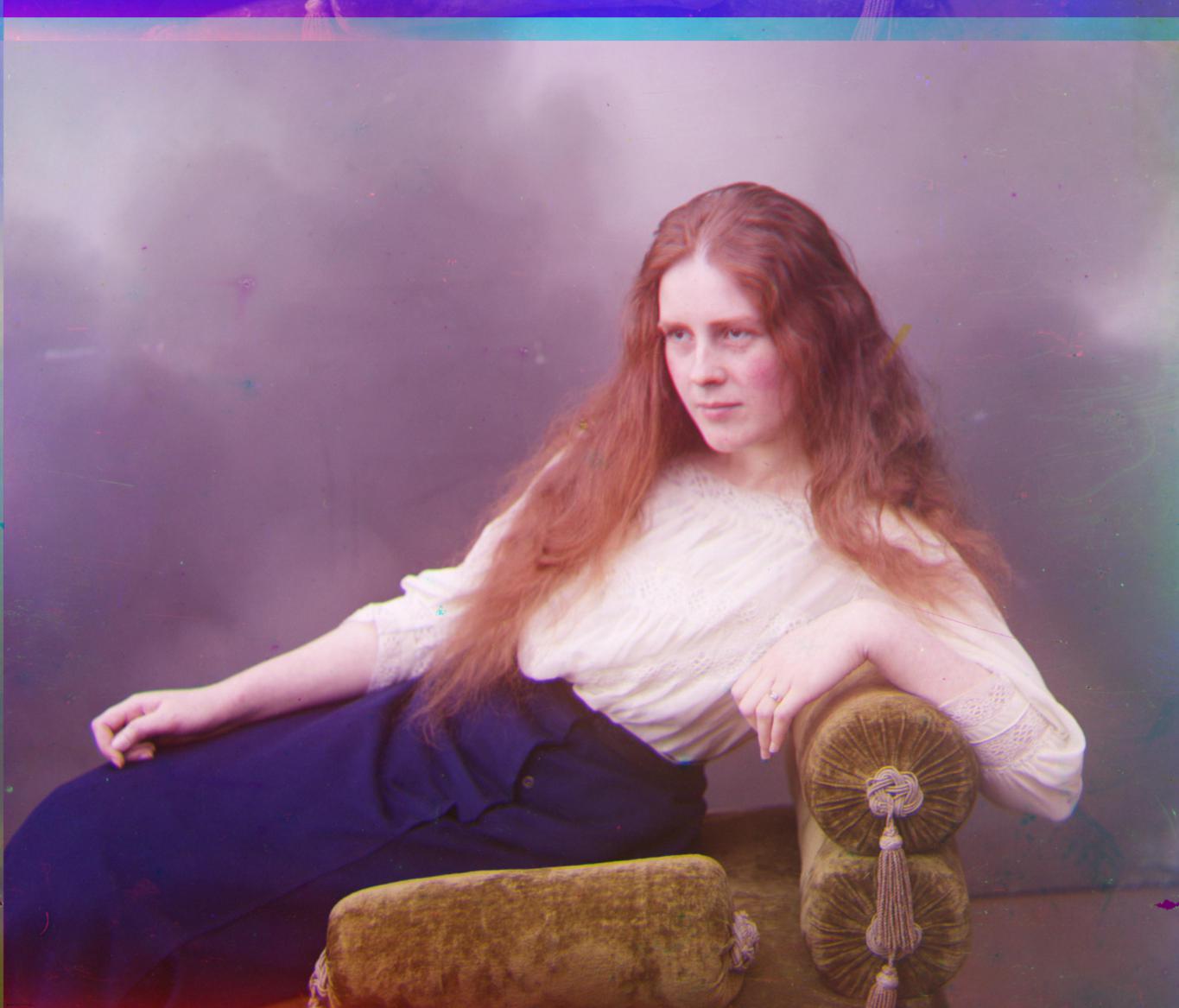
Runtime: 9.9525 secs |
* Monastery

Runtime: 0.5933 secs |
* Nativity
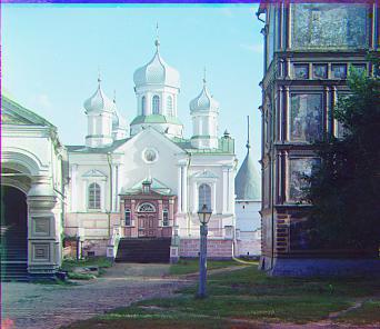
Runtime: 0.7132 secs |
Self
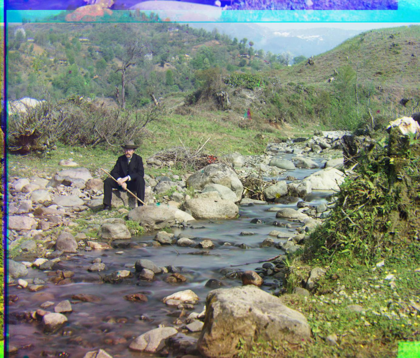
Runtime: 19.6527 secs |
* Settlers

Runtime: 0.5585 secs |
Generations

Runtime: 18.7443 secs |
Train
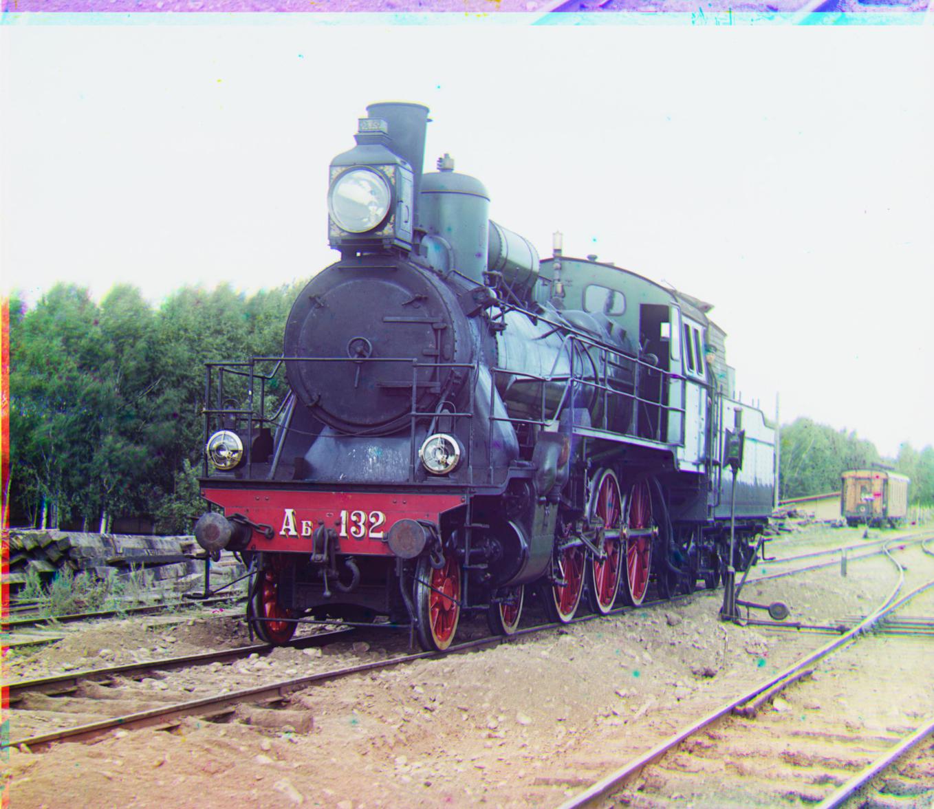
Runtime: 20.0464 secs |
Turkmen
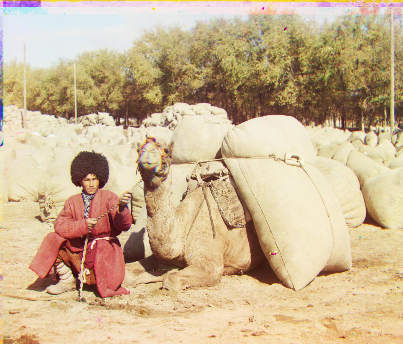
Runtime: 21.6017 secs |
Village

Runtime: 21.0091 secs |
Plaque
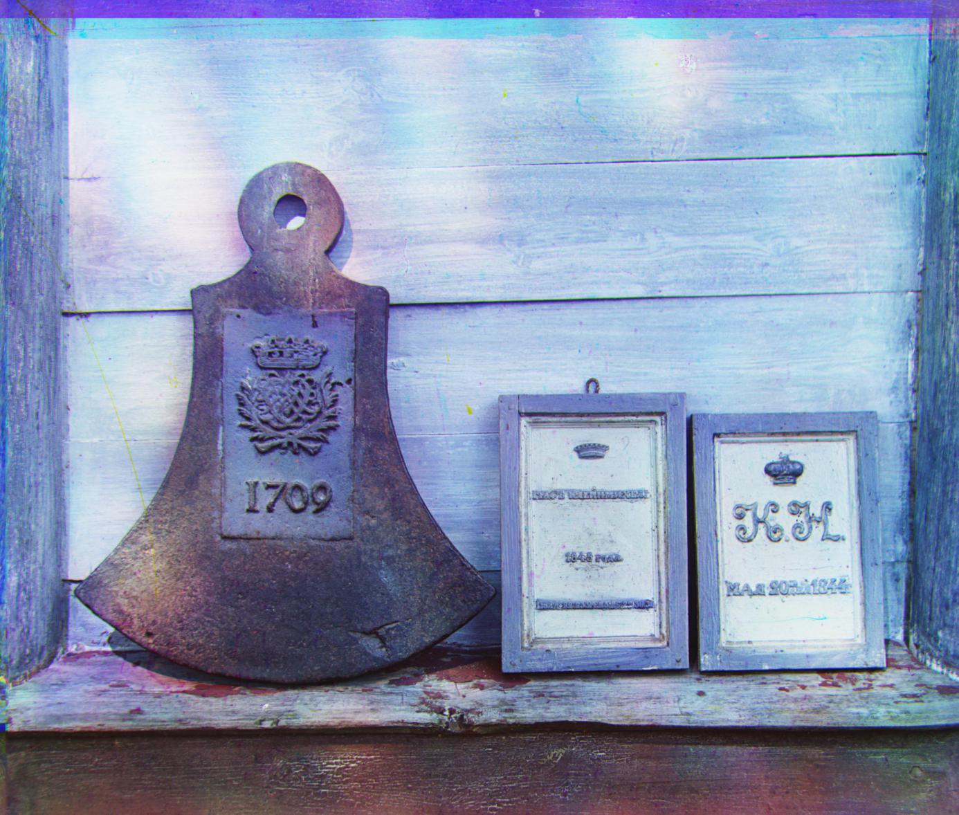
Runtime: 19.7466 secs |
House
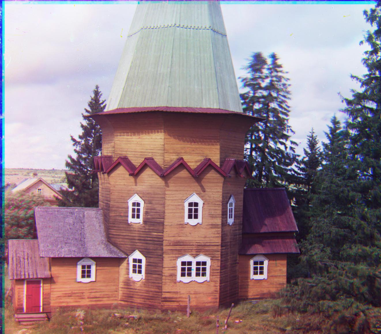
Runtime: 18.4928 secs |
Closet
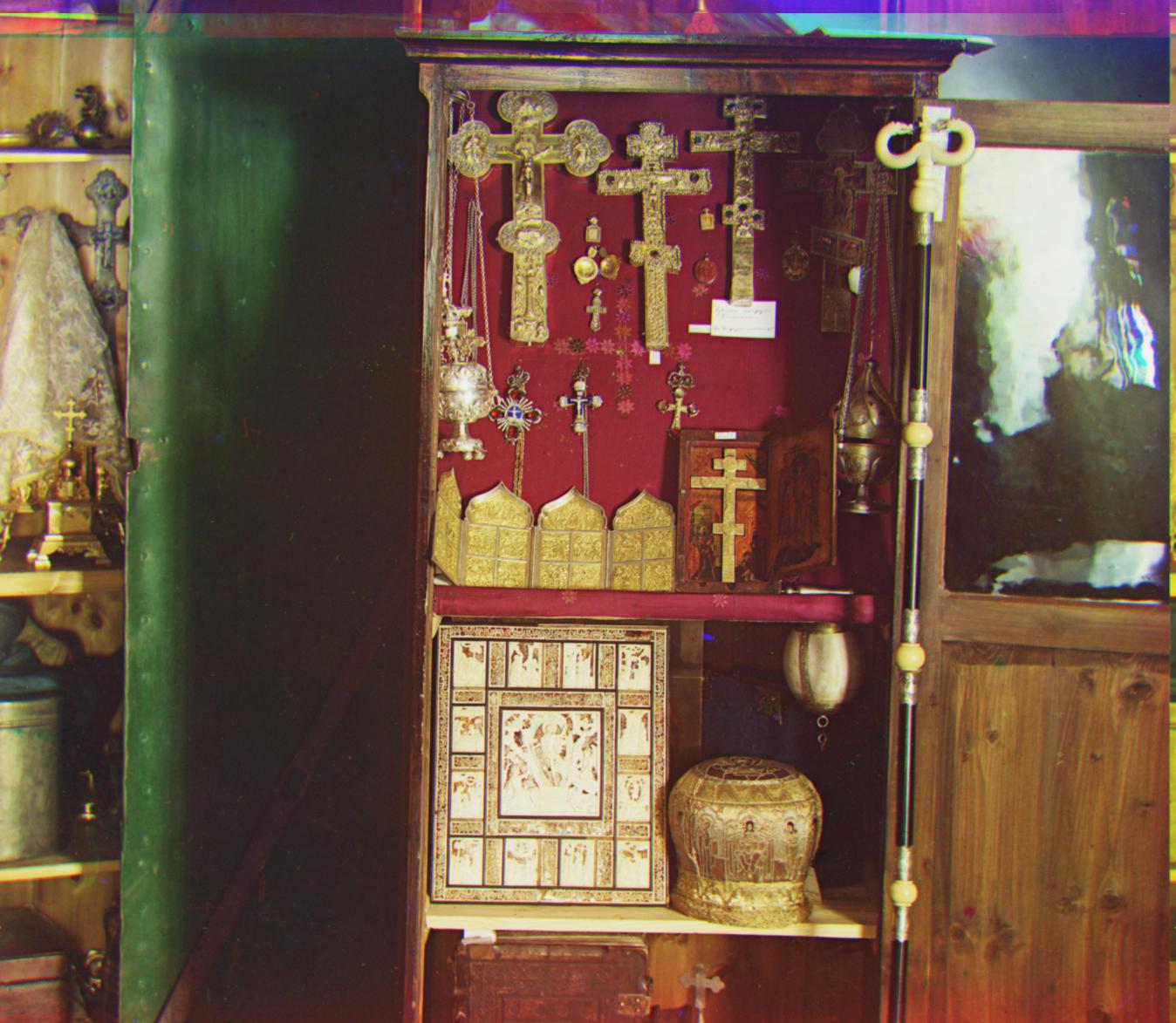
Runtime: 19.07636 secs |
Going Further (Extra Credit)
Contrast Stretching
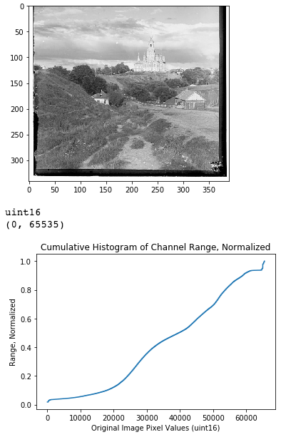
I also implemented a function which does Contrast Stretching (AKA Normalization) on any given channel. This Contrast Stretching function takes in 2D matrix of uint16 values, and remaps them such that the visual contrast of the channel is more noticeable.
Algorithmically, the matrix of uint16 values is first flattened into an array. Then the cumulative histogram of the array is calculated and normalized to [0.0,1.0]. The x-axis of the cumulative histogram has 65536 bins ranging from [0, 65535], and the y-axis is [0.0,1.0]. Define map $T(x)$ to be that cumulative histogram. Then for each pixel in the original channel (each element in the original matrix), the pixel is remapped to $y=T(x)\times65535$.
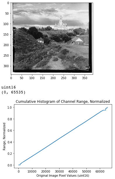
This remapping causes the channel to have better contrast. The non-cumulative histogram of the remapped image is uniform, and the cumulative histogram is a straight ramp.
As an example, here is the Contrast Stretching of the Red channel of Cathedral. Before and after.
Contrast Stretching on RGB RGB Stretching
For the "RGB Stretching" set of images, I applied the Contrast Stretching function above to all three channels BEFORE alignment.
The alignment on the images turned out to be approximately the same as in the original algorithm. (Except Emir).
But the most noticeable difference is the change in colors. Overall, the colors seem much more vivid, saturated, and balanced. Additionally, the black-and-white contrast of the images are more noticeable well. On the whole, the set of images is cooler and more blue in comparison to the origin set. A few of the images are unrealistically colored however.
Under the assumption Prokudin-Gorskii used pure RGB filters, the RGB output images in the original algorithm has strong yellows and sepia tones. This suggests that while the RGB assumption is decent, Prokudin-Gorskii did not actually have pure RGB filters.
Due to the yellow biased images under the RGB model -- if the image does not have a good distribution of blue colors, the RGB Stretching function would make the output image too blue. (Blue is the complement to yellow.) Images with sufficient blue in them turn out very well though. See "Self" image vs "Lady" image.
Specific comparisons below.
Contrast Stretching on Value of HSV HSV Value Stretching
Seeing that alignment did not change with the RGB Stretching, for the "HSV Value Stretching" set I did processing AFTER alignment. After aligning the images using the original algorithm, I converted the RGB image to HSV space. Note that the Value parameter in HSV corresponds to black-and-white contrast of images. Then I performed Contrast Stretching on that Value parameter. Essentially, this attempts to improve black-and-white contrast without changing the hues in the image. As shown below, this worked well.
Contrast Stretching on SV of HSV HSV Saturation and Value Stretching
For the "HSV Saturation and Value Stretching" set, I did the same thing as HSV Value Stretching, but I also called the Contrast Stretching function on the Saturation parameter of HSV.
This change produced more realistically colored images than just Value Stretching. That saturation of colors seem to be better balanced, meaning nothing is too unsaturated or too saturated. But the images also seem less vivid overall.
Alignment Over Scale and Rotation 5D Transform
Based on the technology available to Prokudin-Gorskii, not all three panels in the image plates were perfectly captured at the exact same point in 3D space. As a result, the photos in each panel may be slightly out-of-scale with each other. (I.e. different zoom levels.) Furthermore, when the plates were transfered to a digital format, some of the panel photos may have been slightly rotated.
To account for this, we increase the dimesionality of the search space to include vertical scaling, horizontal scaling, and rotation, in addition to the original vertical and horizontal translation. For scaling, I assumed channel $A$ is no more than +/-5% scaled than channel $B$ in each direction. For downscaling channel $A$, I padded with gray (0.5) values; and for upscaling $A$, I had to crop out edge pixels. For rotation, I assumed channel $A$ is no more than +/-5 degrees rotated than channel $B$.
I took advantage of the recursive image pyramid approach to speed up the 5 dimesional search, but the large .tiff images took about half an hour each to process.
In terms of alignment, the results were worth it though:
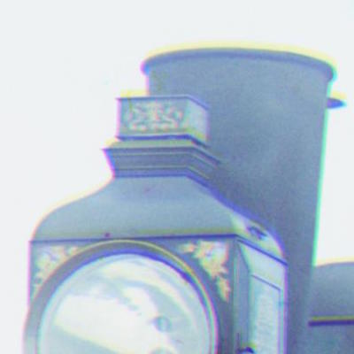
Notice that the train's chimney has a band of yellow above it. Also notice the wheels in the original alignment, there is a band of yellow below it. This suggests the Green channel is misaligned in terms of vertical scale, relative to the other two channels.
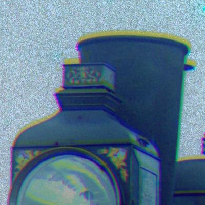
This image included to better see the yellow band above the chimney.
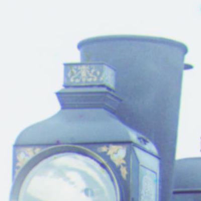
The yellow band is gone. The lantern rim is more defined, and the gold leaf is less blurry. This is a better alignment of the Green channel!
Final Comparisons (Images Clickable)
- Overall, HSV Value Stretching provides a better image than the original by boosting black-and-white contrast. HSV Saturation stretching provides a good color boost and balancing to the original, but can sometimes oversaturate the color to being unrealistic.
- RGB Stretching improves color balance, saturation, and contrast when the original images has sufficiently even amounts of yellows and blues. But if there is not enough natural blue range, the resulting image takes on a blue and purple tint.
- 5D alignment provides better image quality and alignment in most cases, but the difference is not as apparent as the color space operations.
Channels relative to Blue.
Key: channel[Vertical Translation pixels, Horizontal Translation pixels, (Vertical Scale, Horizontal Scale, Rotational Degrees)]
Original Algorithm |
RGB Stretching |
HSV Value Stretching |
HSV Saturation and Value Stretching |
5D Transform |
|
|---|---|---|---|---|---|
Cathedral

|
Cathedral
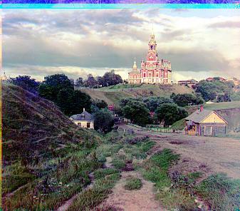
Better contrast than original, but unrealistic blues on the hillside. |
Cathedral

Better contrast than original. |
Cathedral
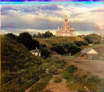
Better contrast than original and more vivid colors. |
Cathedral

R[3 -1 1.0375 1.0125 0.0125] |
|
Emir

"I'm too blue." |
Emir
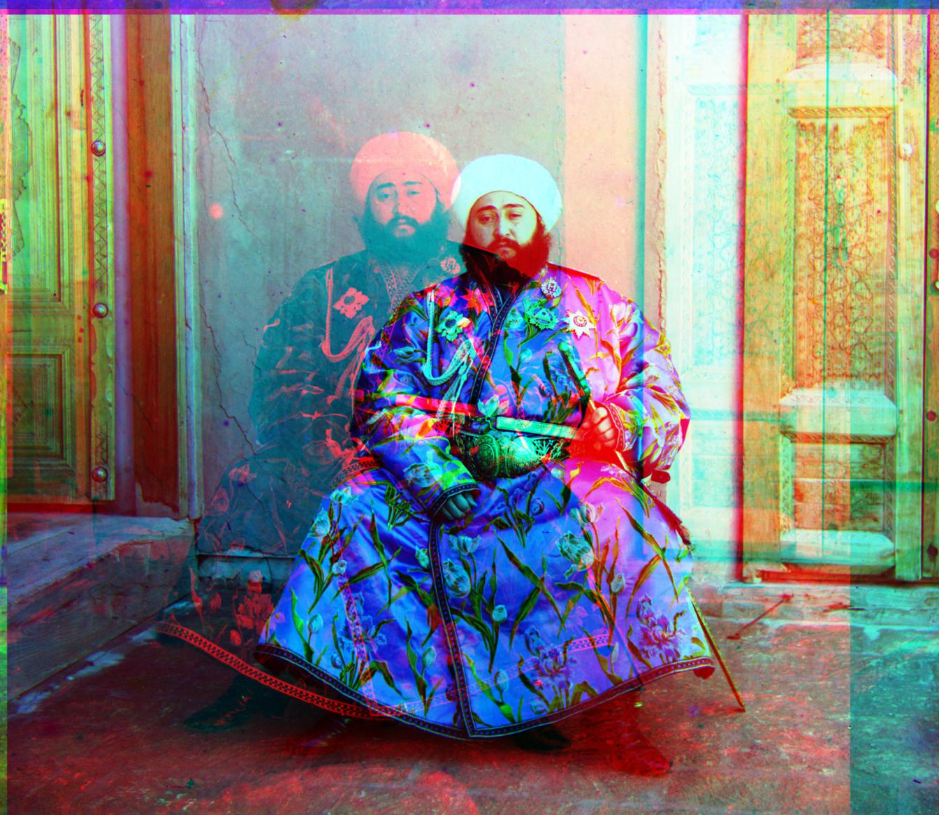
|
Emir
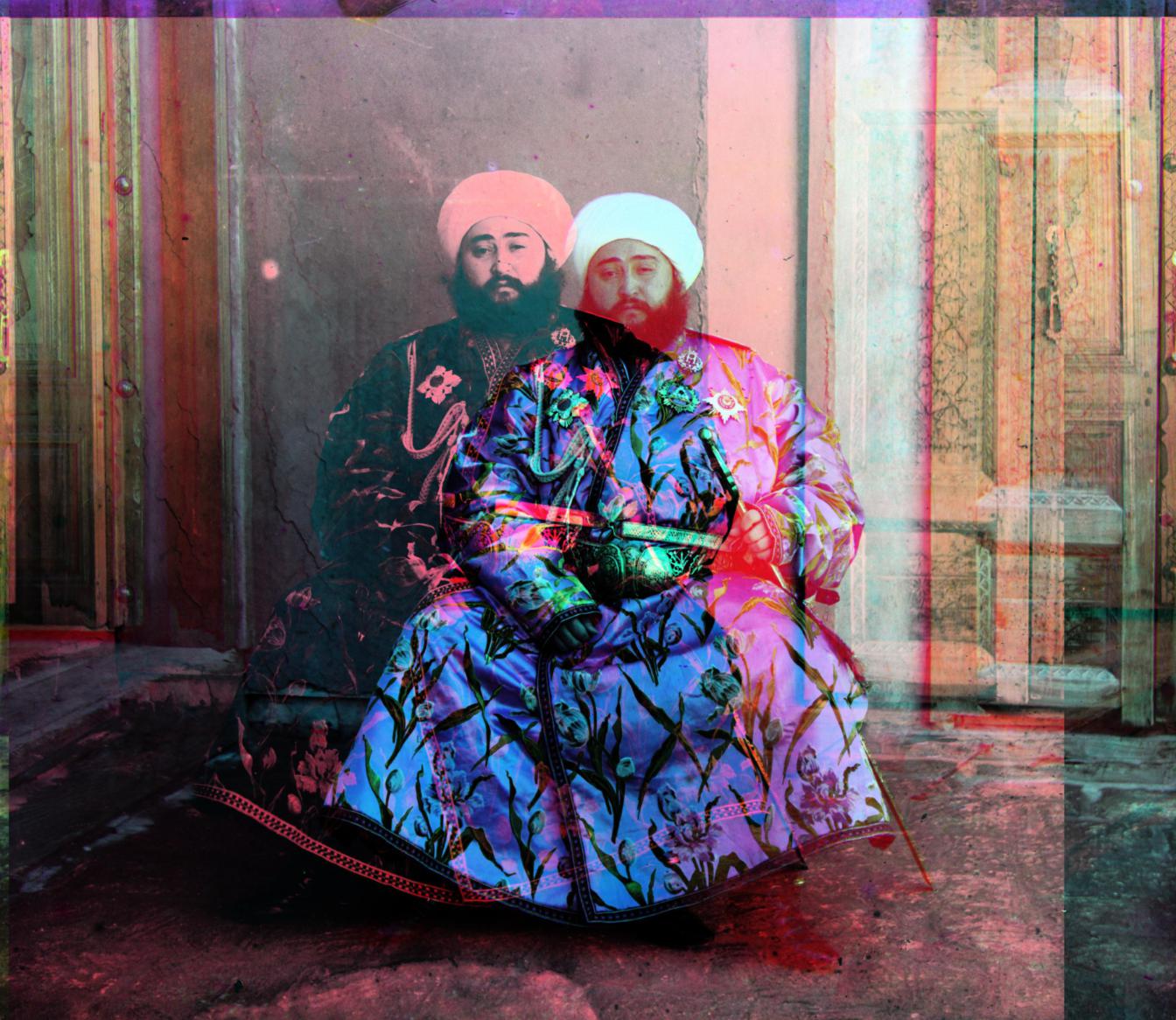
|
Emir
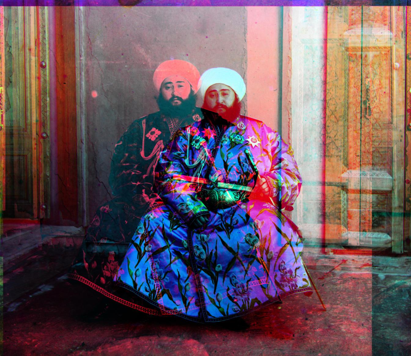
|
Emir
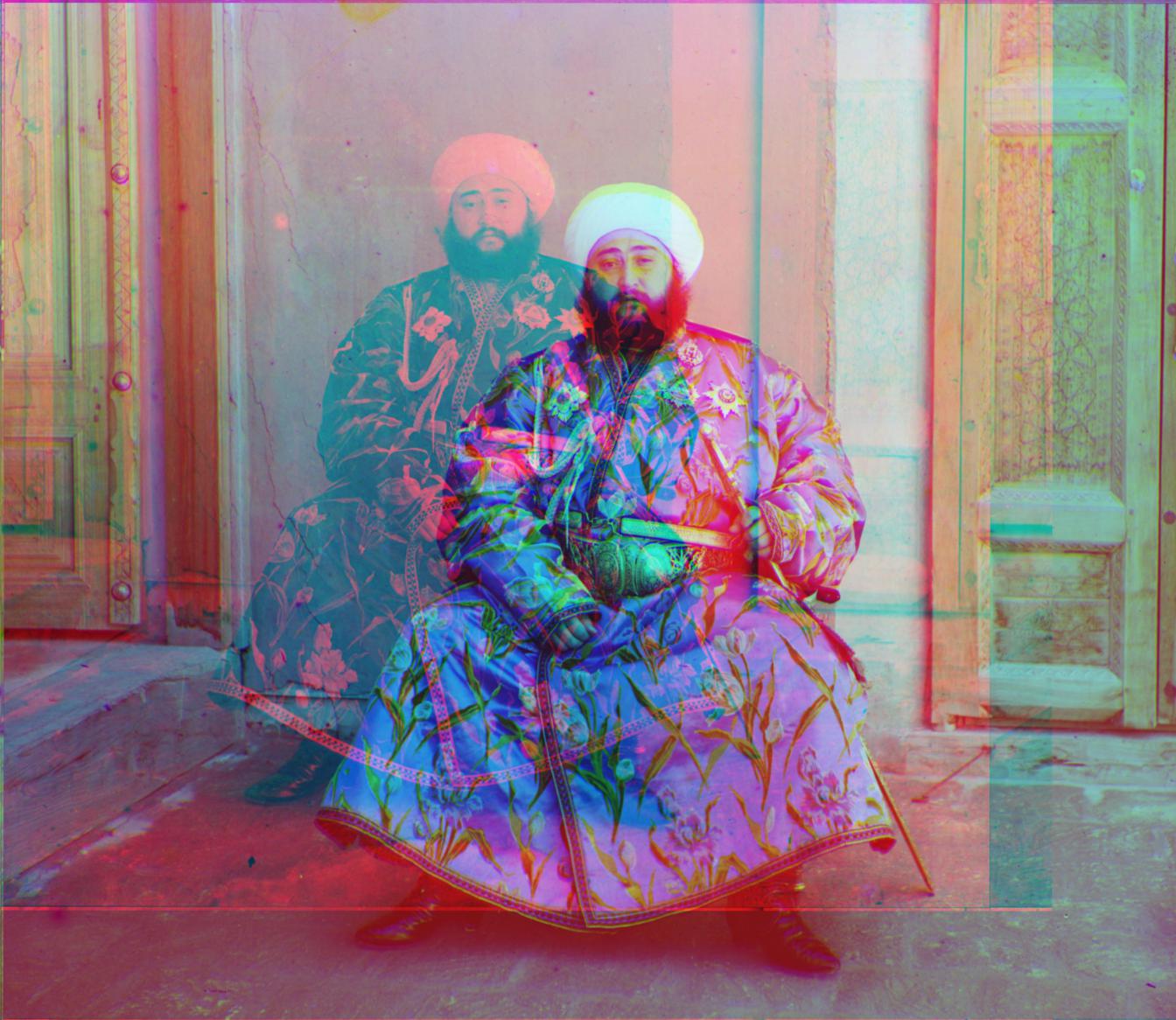
R[-13 -175 0.9429 0.9429 -0.0470] |
|
Harvesters

Honestly, the lady who moved during the photo looks like a ghost and creeps me out a little. |
Harvesters
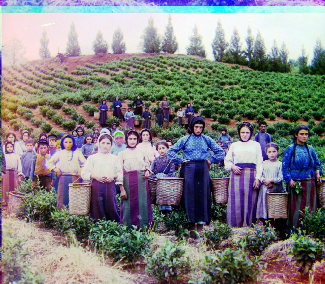
More balanced coloring. Less sepia tones, but plants are bluer than in real life. |
Harvesters
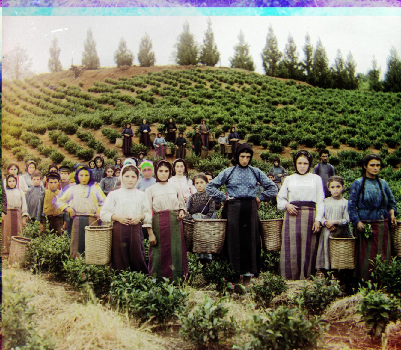
Better contrast with fairly good colors. |
Harvesters
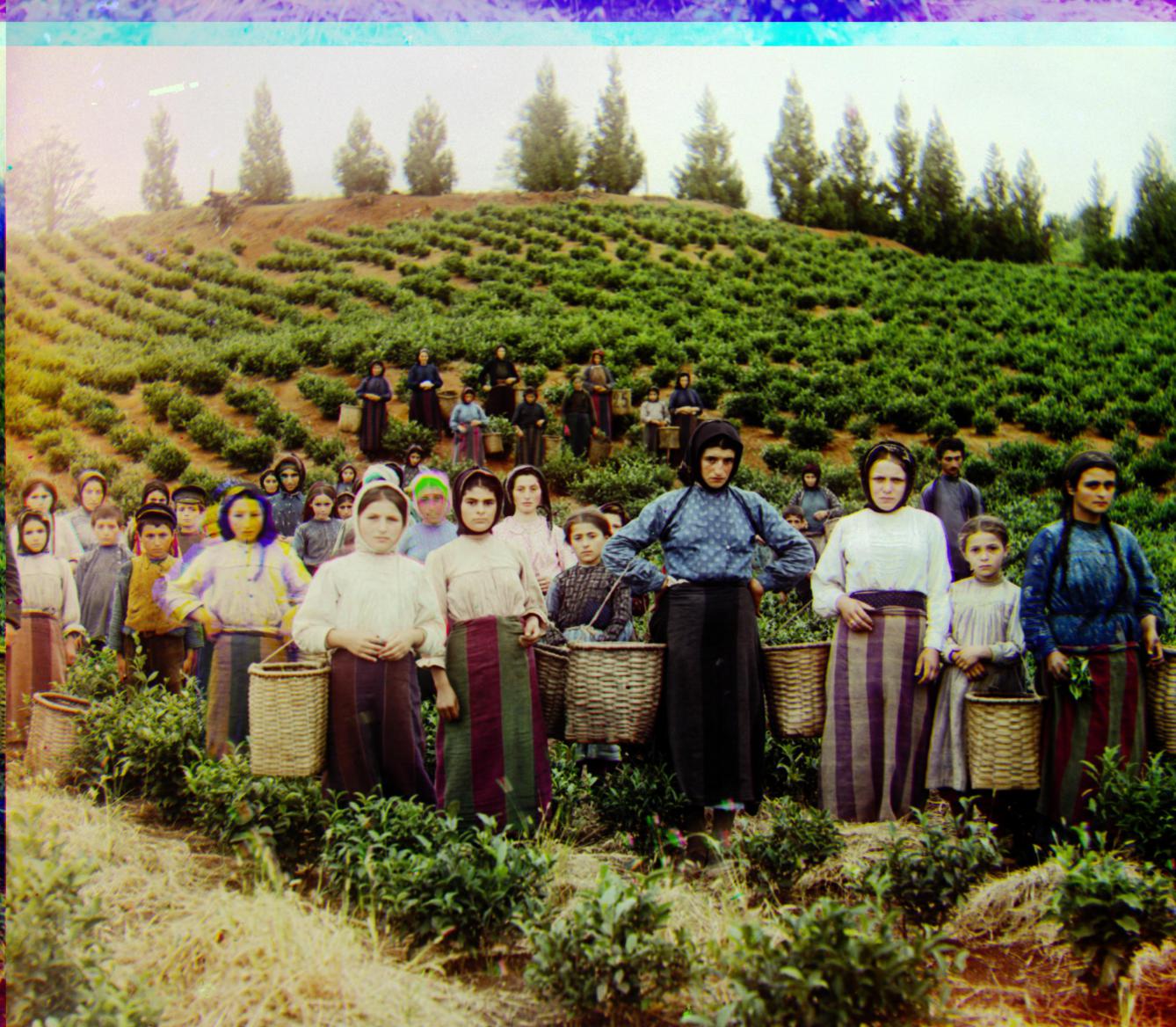
More vivid colors than previous image. |
Harvesters
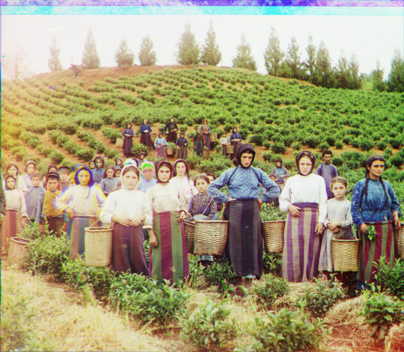
R[116 9 1.0020 0.9991 -0.0570] Slightly worse alignment than the original. The error could potentially be due to the high frequencies in the image, and the noise caused by the windy day. Notice the tall grass in the foreground. |
|
| Icon
Very gold and yellow. Pretty good alignment to begin with. |
Icon
As opposed to the above images, located in landscapes outside, this image has a more actual blue colors. This prevents the RGB scaling from becoming overly blue like in the above images. The fence and the blue dome has an appealing teal to it. The red and gold are strong without being overbearing. |
Icon
More contrast, the shadows helps bring out the gold coloring. |
Icon
Good contrast, with gold and red very saturated and strong. Weaker blues. |
Icon
R[84 22 0.9991 1.0029 -0.0070] About the same quality as original, slightly rotated. |
|
Lady

|
Lady
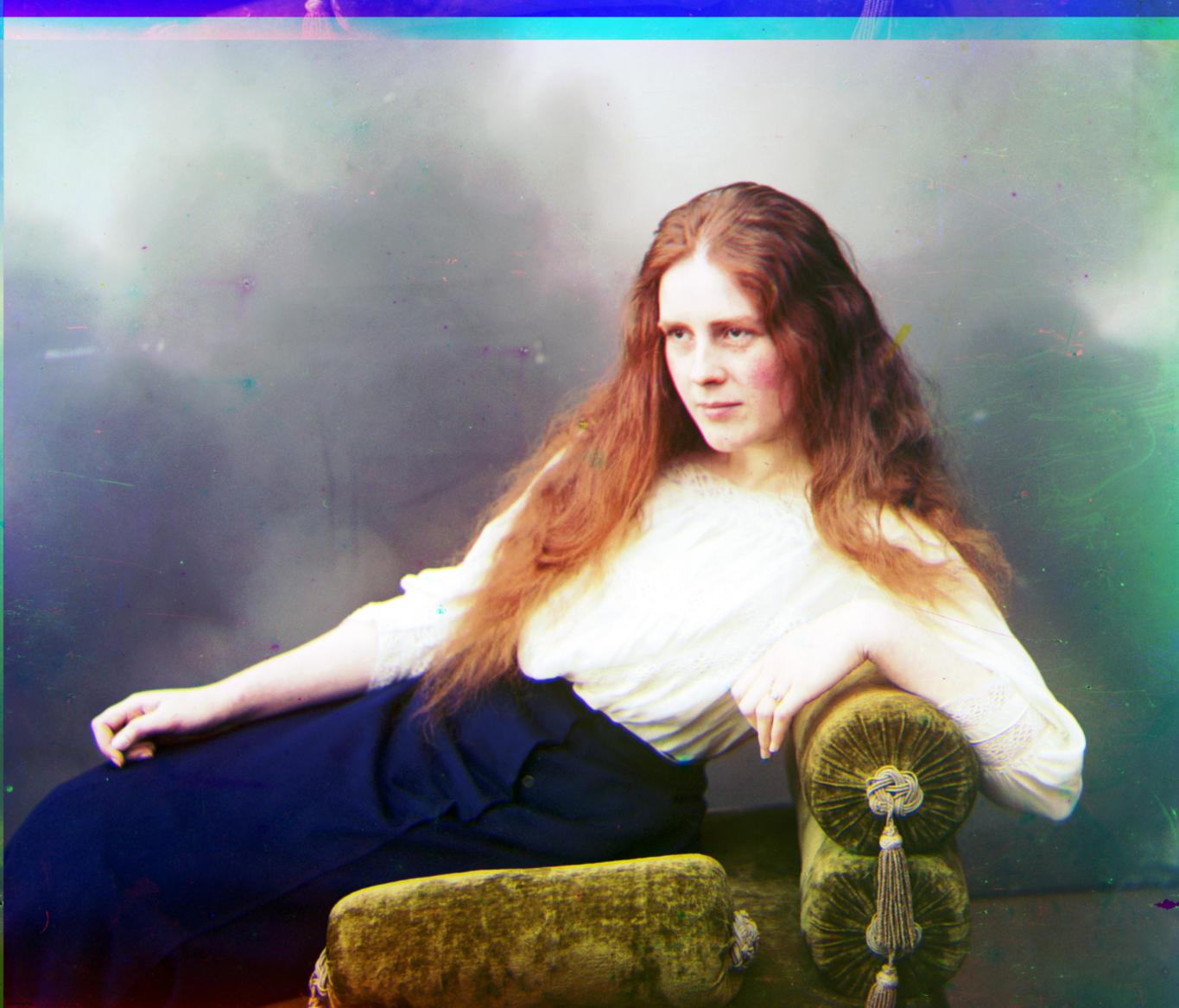
Much better coloring than original. I suspect the blue dress helps the RGB balance. More natural skin color than all the others. |
Lady
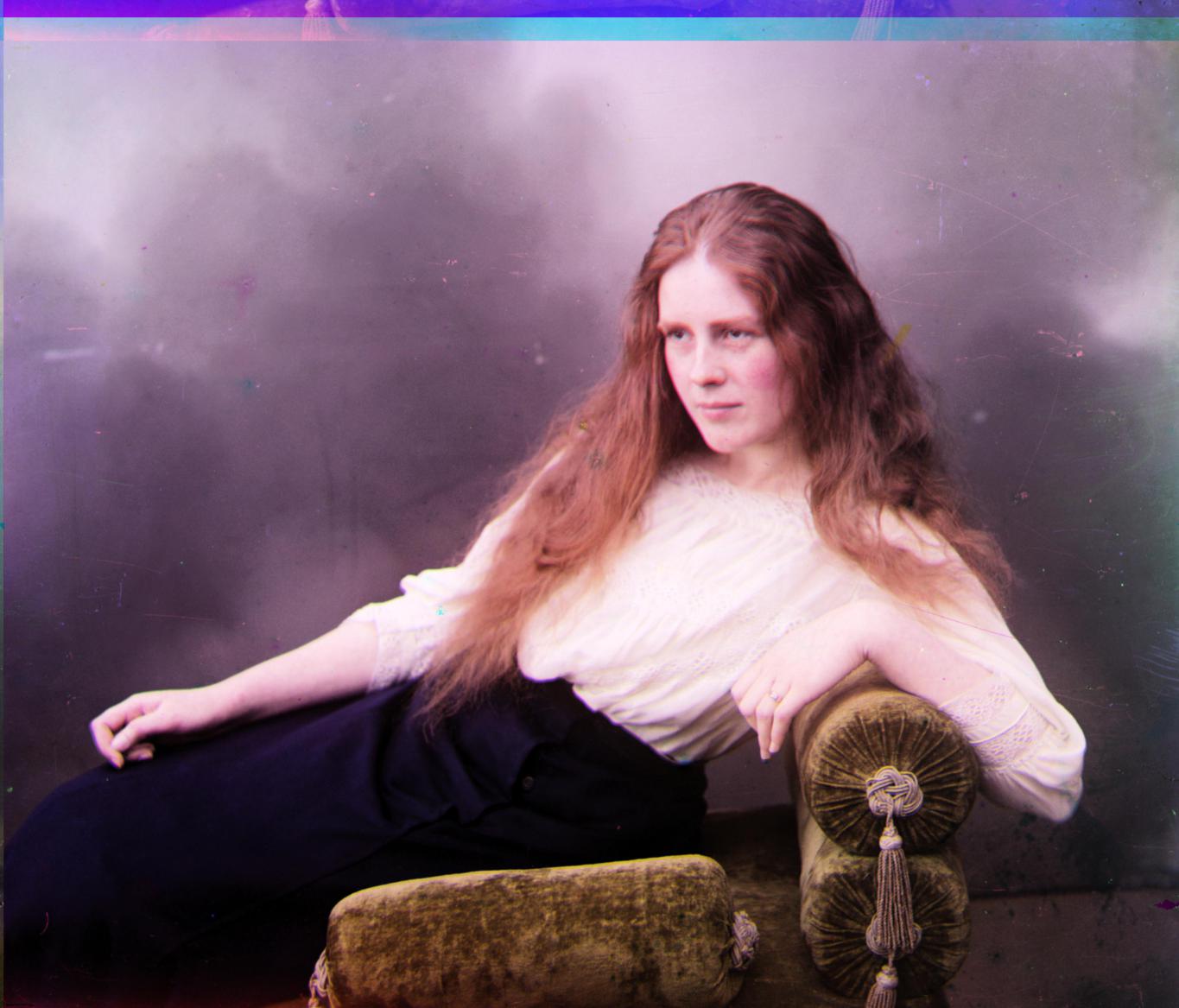
Decent image, although a bit gray overall. |
Lady
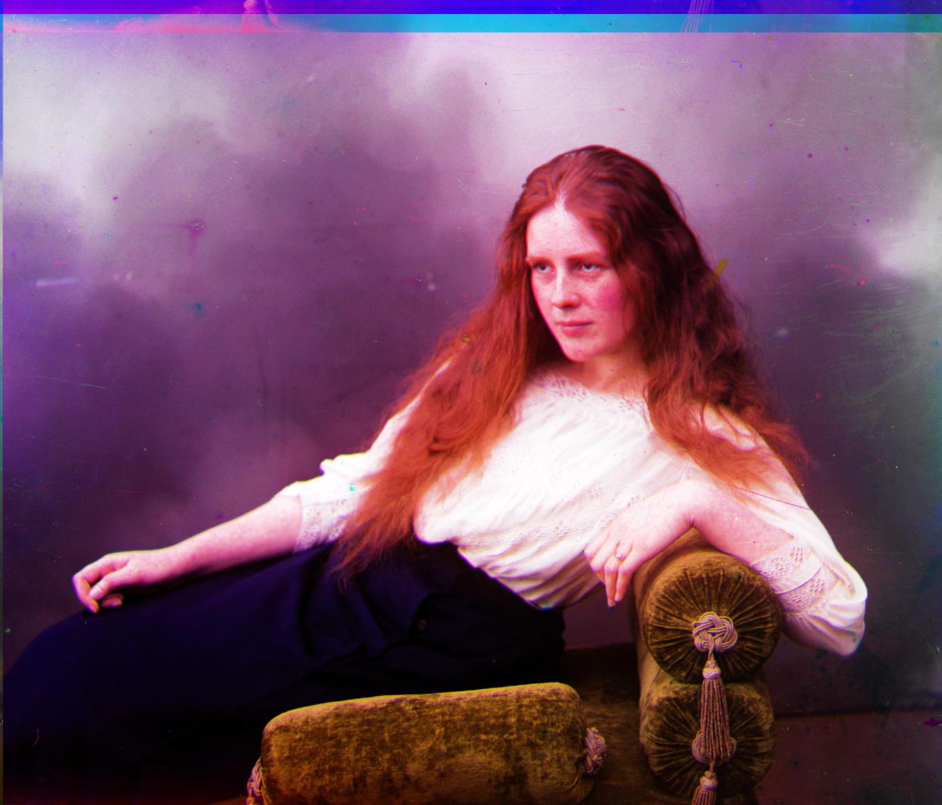
Medical attention recommended. |
Lady

R[45 3 1.0195 0.9991 0.0220] |
|
Monastery

|
Monastery
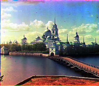
Very vivid colors across the image. More pleasant to look at than the other images. |
Monastery
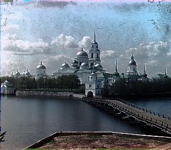
A little too gray. |
Monastery
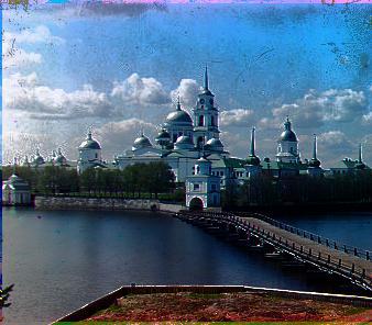
|
Monastery
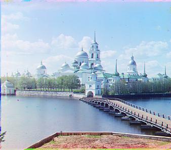
R[1 0 1.0 1.0 0.0375] |
|
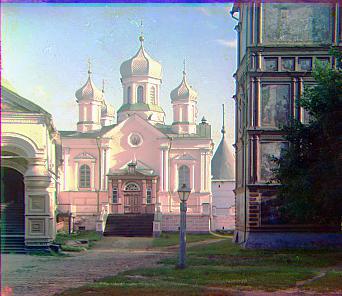
Nativity

|
Nativity
More neutral white colors, better than the others. |
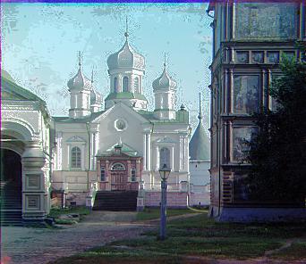
Nativity
|
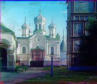
Nativity
Very saturated colors. It almost looks like the building is outlined. |
Nativity

R[3 -1 1.0125 1.0062 -0.0375] |
|
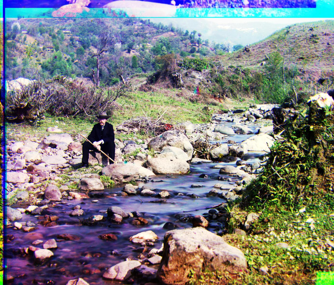
Self

|
Self
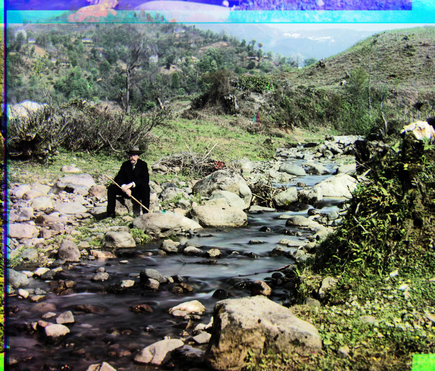
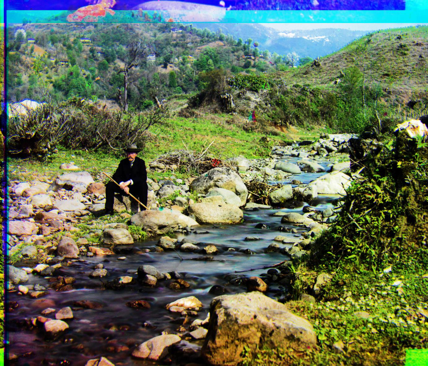
The blue is too strong once again. Notice the bottom left corner of the river. The water is unrealistically purple. |
Self
|
Self
Good coloring and contrast overall. |
Self
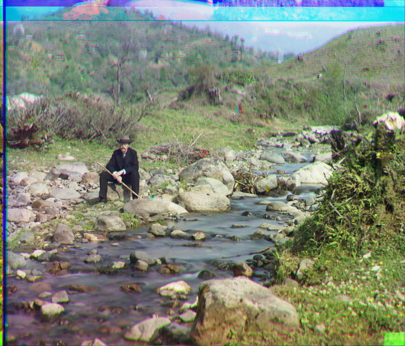
R[171 31 0.9991 0.9991 -0.0570] The center of the image appears very in focus. Colors and alignment in that region is good. But, the edges of the picture are out of focus. Notice the alignment differences between the rock and the branches. The misalignment on the edges of the image give the illusion of depth-of-field. I suspect the high frequencies in the branches fooled the algorithm into misalignment. |
|
Settlers

|
Settlers
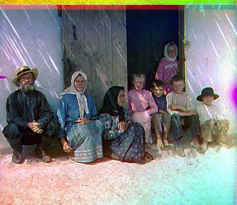
Good color saturation and contrast. May be a little too blue once again, as there is not much blue in the background. |
Settlers

Good contrast with already decent colors. |
Settlers
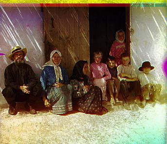
Good contrast, but overcompensates the color too much. Notice the purple shadow on the upper left corner. |
Settlers
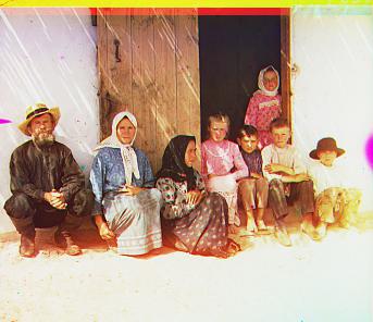
R[9 -2 1.0125 1.0062 0.0] |
|
Generations

|
Generations
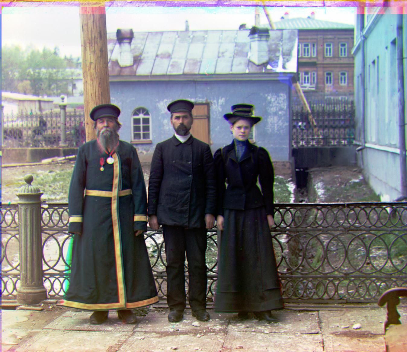
Good color balance, owing to the blue background. |
Generations
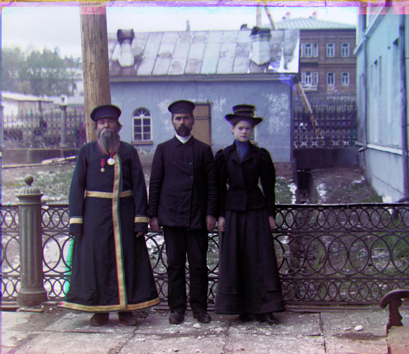
|
Generations
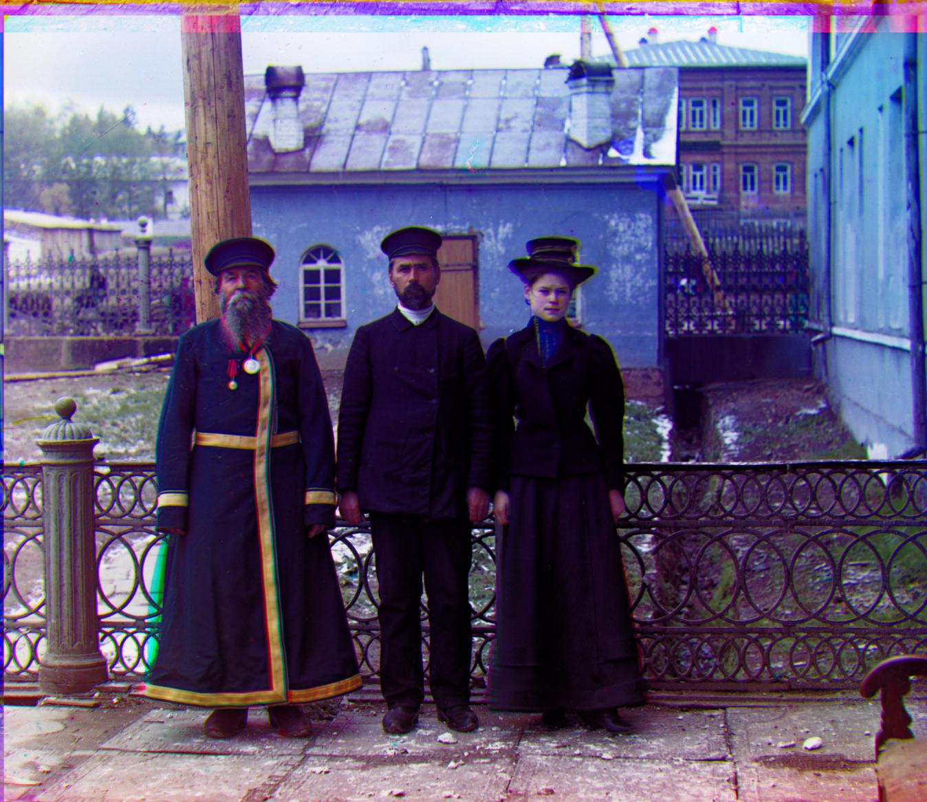
The blue is too saturated in this case. |
Generations
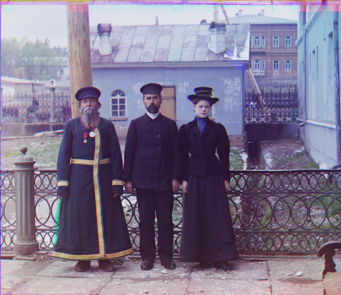
R[109 6 1.0029 0.9991 0.0179] Better alignment of all filters. Notice the woman's hat - it no longer has a yellow outline. Notice the left man's hat, the green and yellow outlines are removed. The same man's waist belt no longer has a blue outline. The chromatic aberation on the left man's big medal is reduced. It is originally circled by a rainbow of red, purple, blue, green, yellow. Now it is only red and cyan offset. The vertical gold belt has red borders removed as well. |
|
Train

A bright image of a train. |
Train
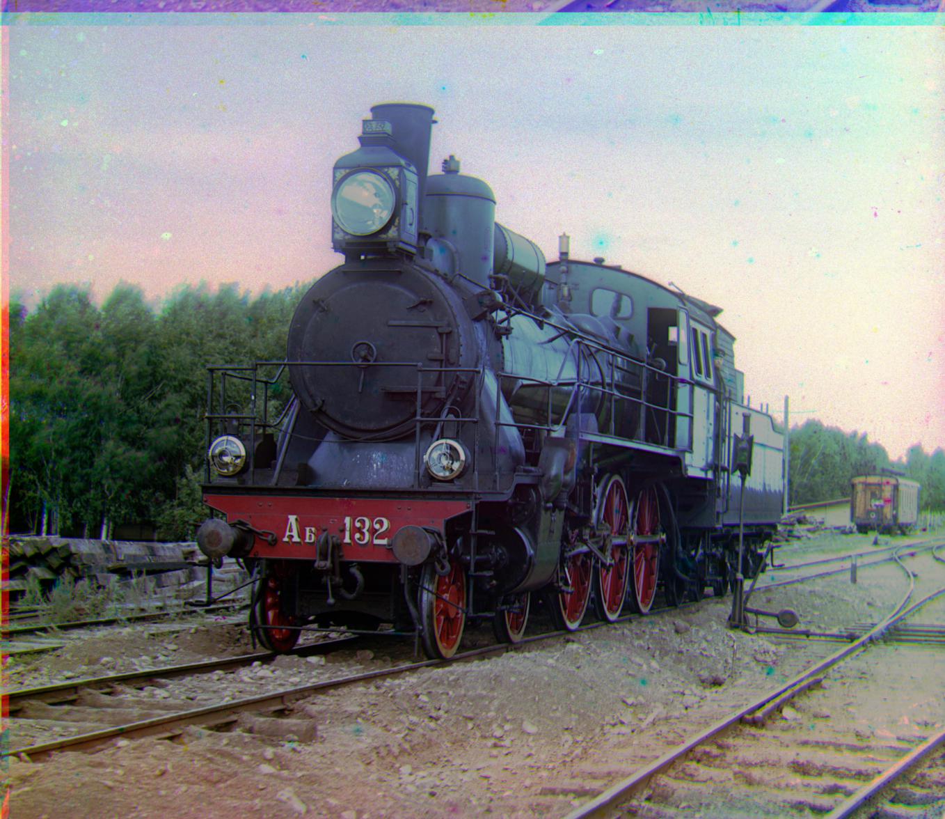
The brightness of the image is toned down. The colors here makes the image look like it was taken at sunrise or sunset rather than near noon. The shadows in the image show that it is actually around noon though, so this coloring is unrealistic. |
Train
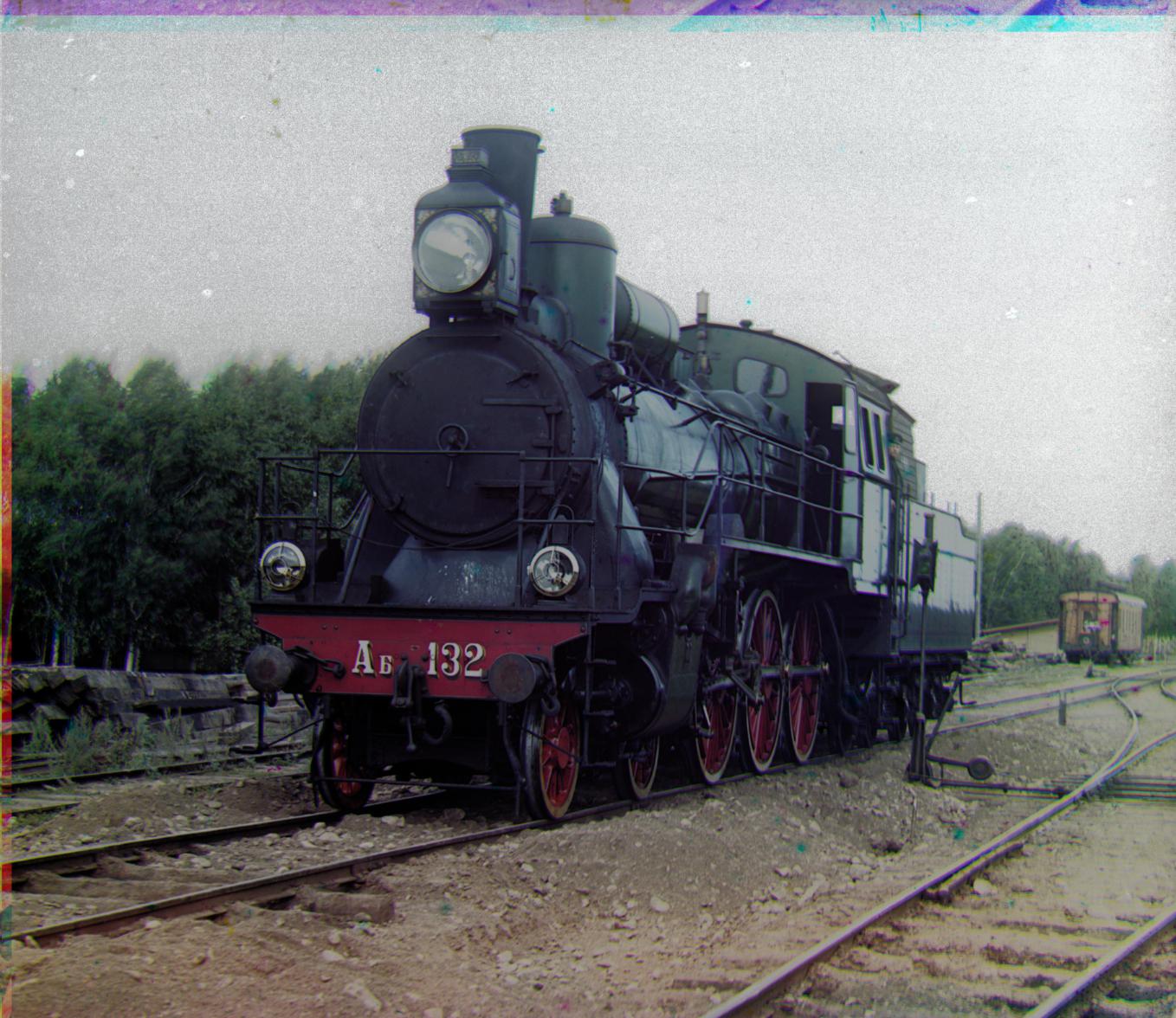
Same comment as RGB contrast. |
Train
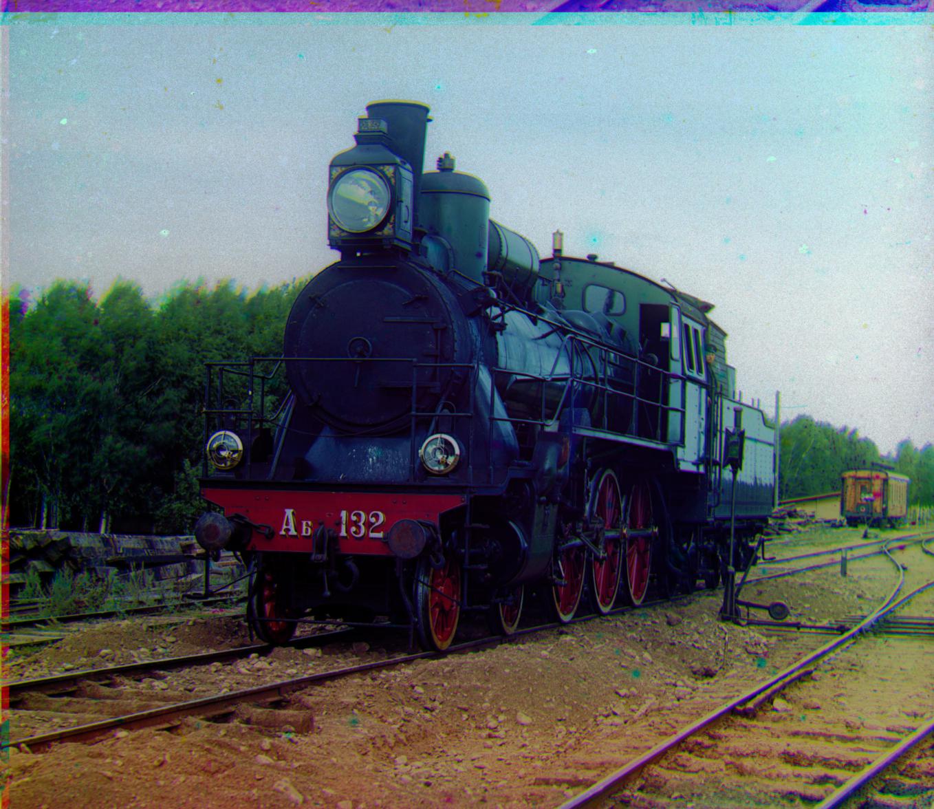
Too blue and dark for noon. |
Train
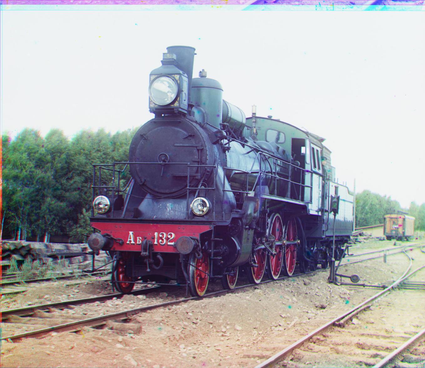
R[9 15 1.0035 1.007 -0.0570] Notice the chimney: The yellow band is gone. The lantern rim is more defined, and the gold leaf is less blurry. The train tracks on the bottom right have also improved, reducing yellow and magenta borders. |
|
Turkmen

|
Turkmen
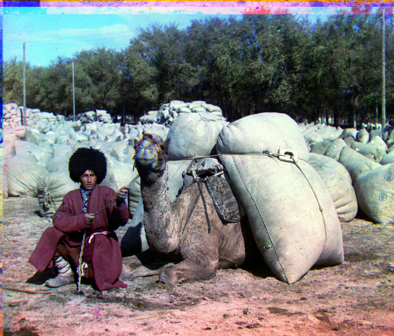
Again, the lack of blues make this contrast stretched image appear too blue. |
Turkmen
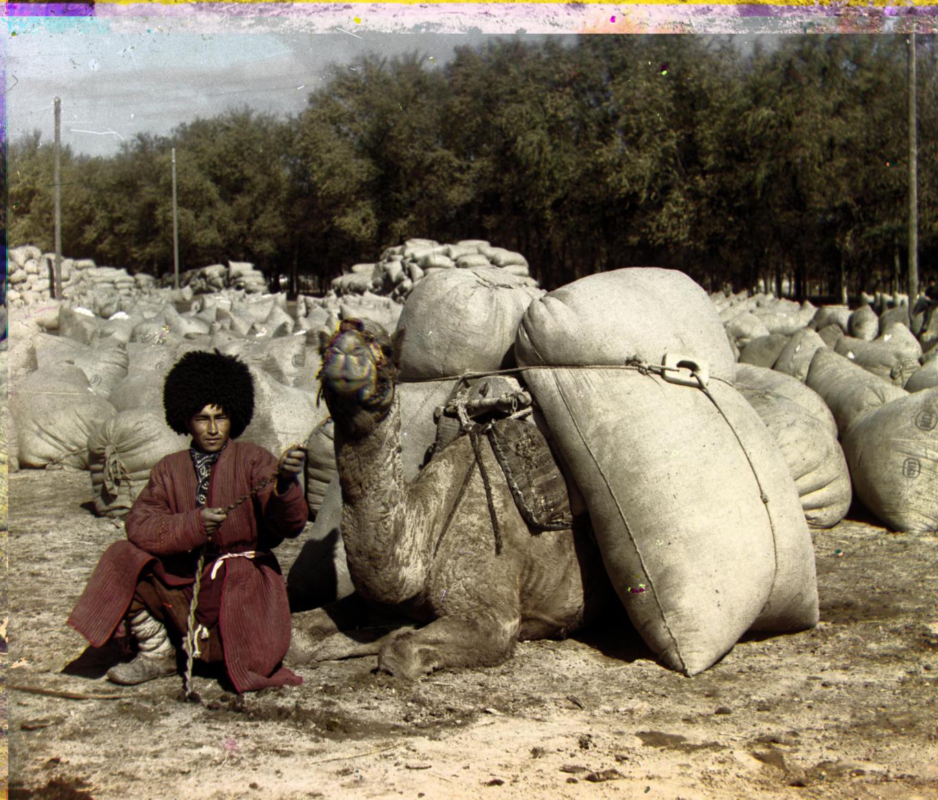
Good contrast, but very gray. |
Turkmen
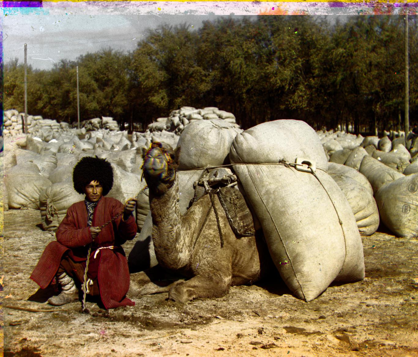
Good contrast and color saturation. |
Turkmen

R[116 24 1.0014 0.9991 -0.0508] Improvement in the coloring of the rope that the man is holding. |
|
Village

|
Village
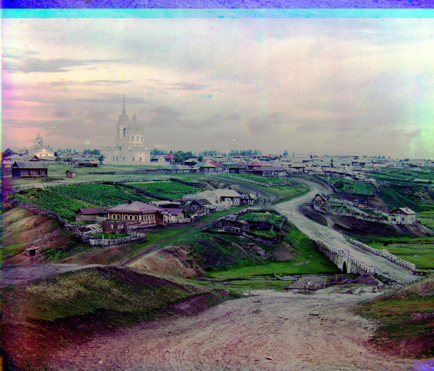
More vivd colors compared to the original. Hover, parts of the sand on the bottom of the image appear purple and unrealistic. |
Village
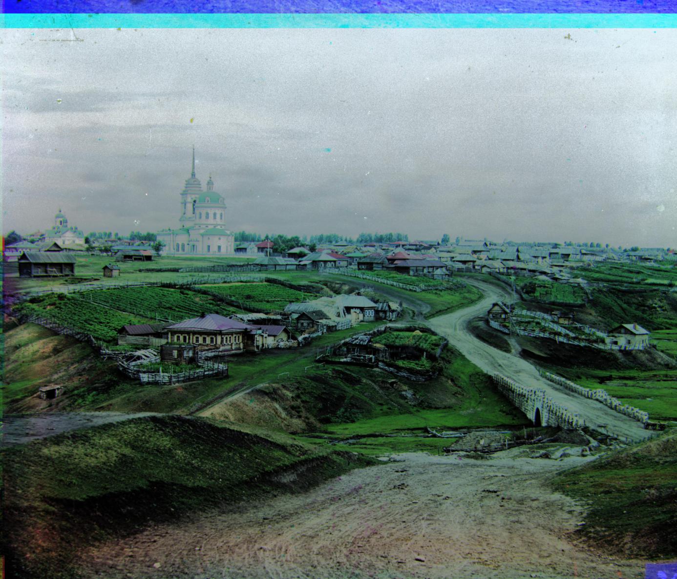
|
Village
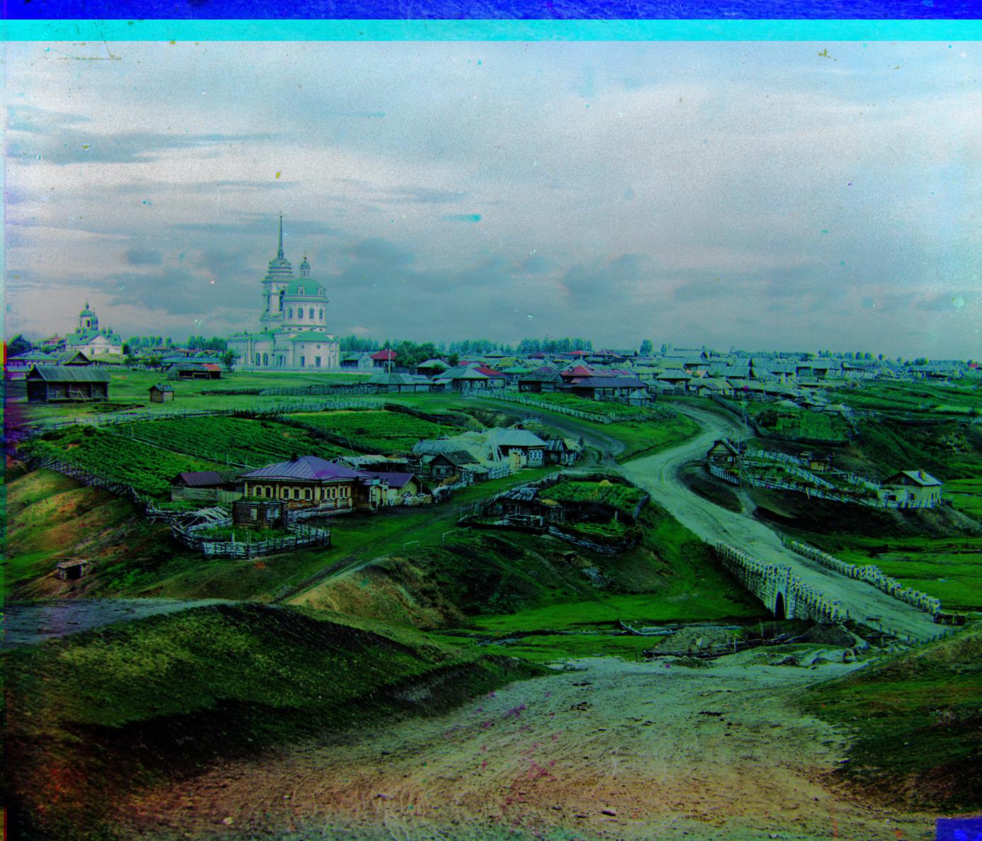
Very saturated colors, making the photo appear unrealistic. Even stronger blue tones than the RGB Stretched image. |
Village
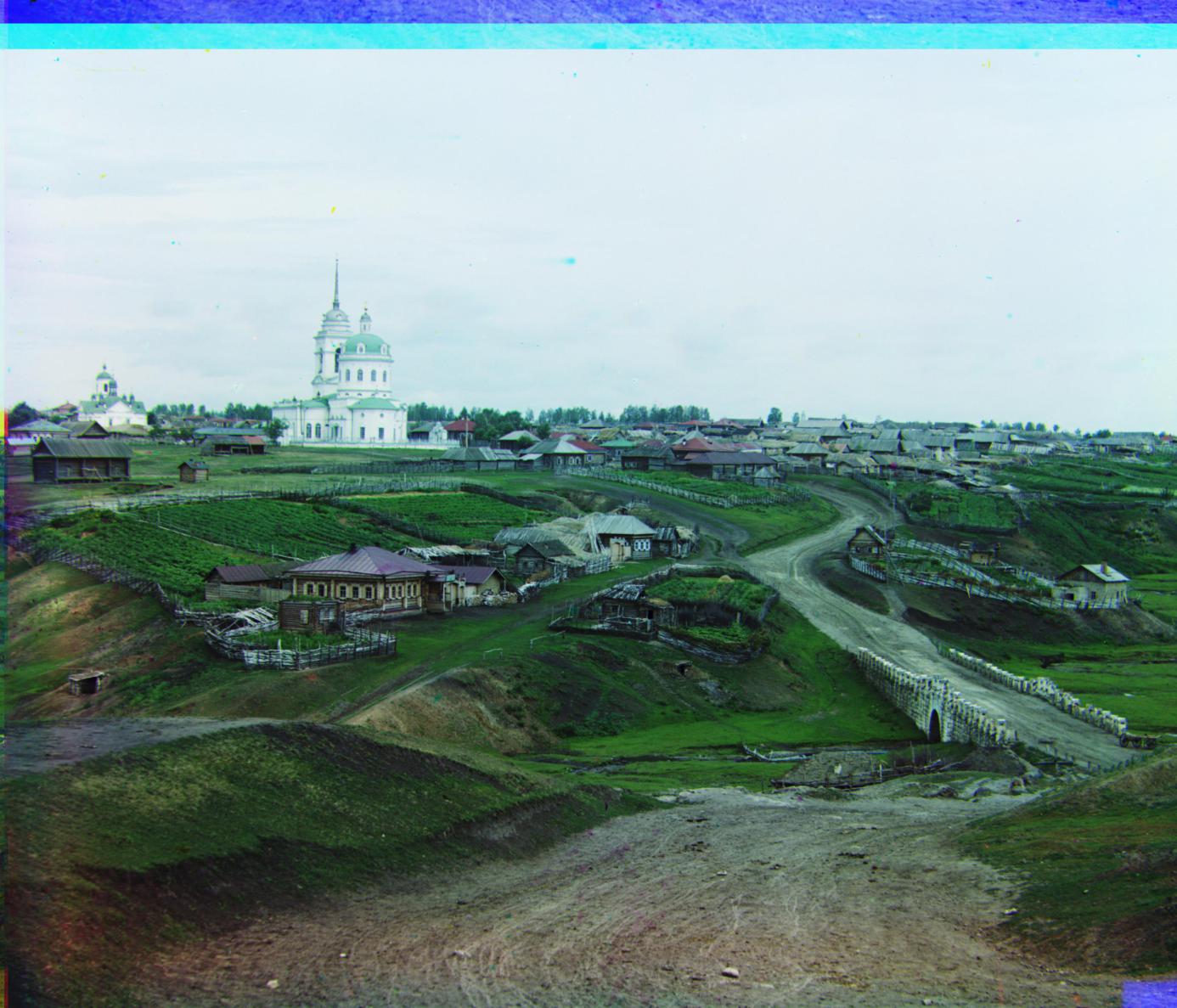
R[137 21 1.0006 1.0029 -0.0345] |
|
Plaque

Image is biased towards blue instead of yellow. |
Plaque
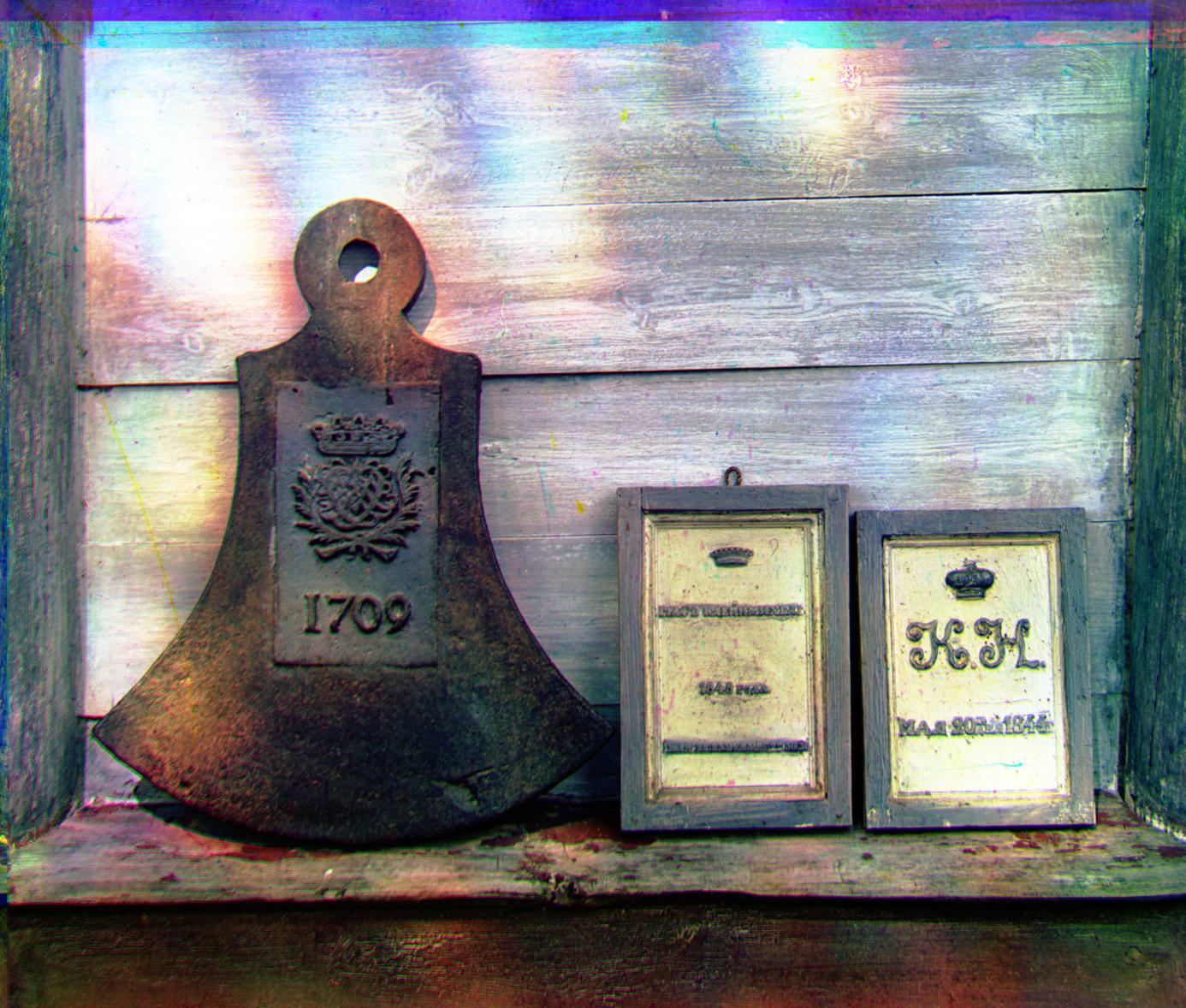
Very well balanced colors with good saturation. Removes the blue tint. |
Plaque
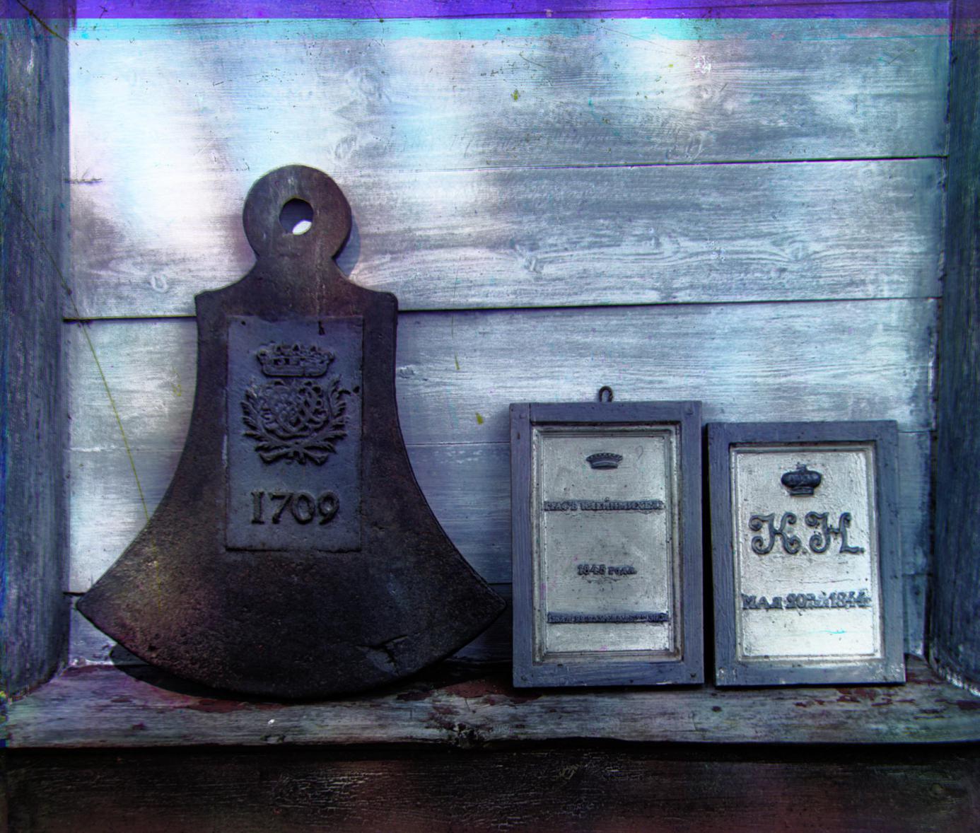
|
Plaque
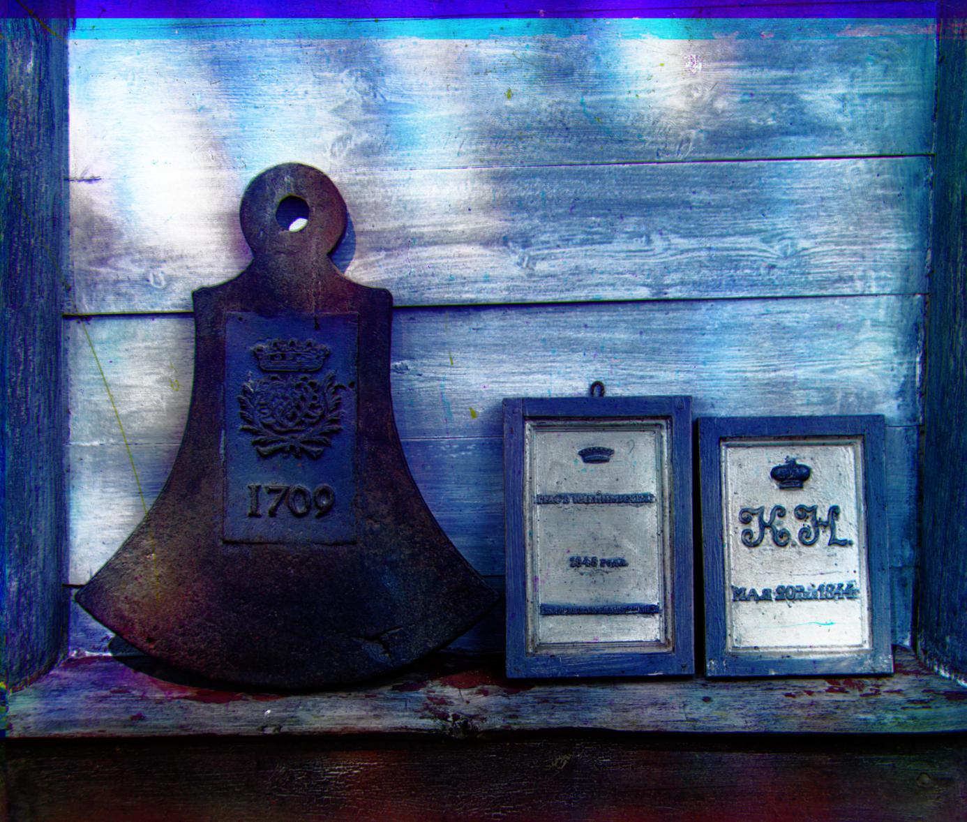
Unpleasantly blue. |
Plaque

R[103 7 1.0054 1.0070 -0.0377] |
|
House

Looks like a picture from the 70s. |
House
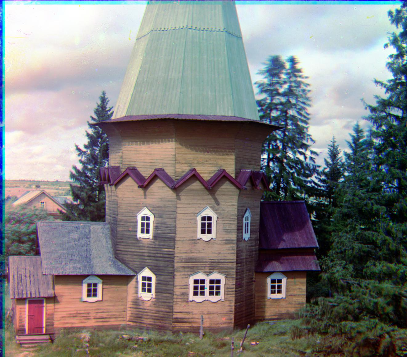
Better contrast and greens, but a little on the blue side. |
House
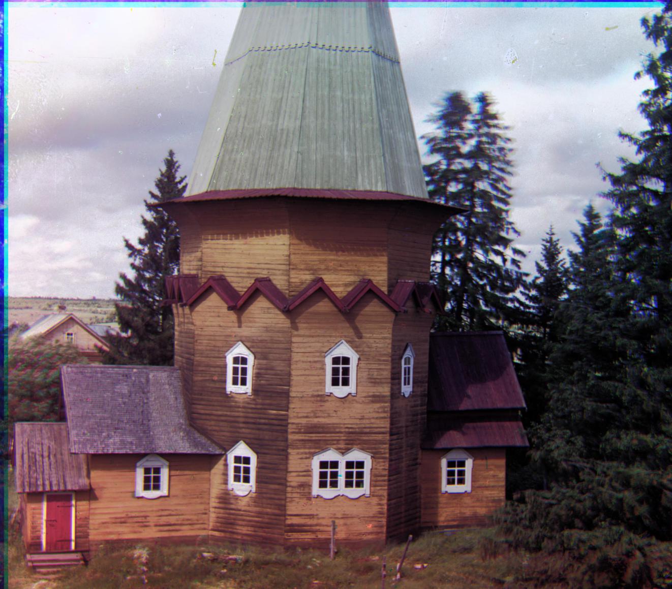
A little gray. |
House
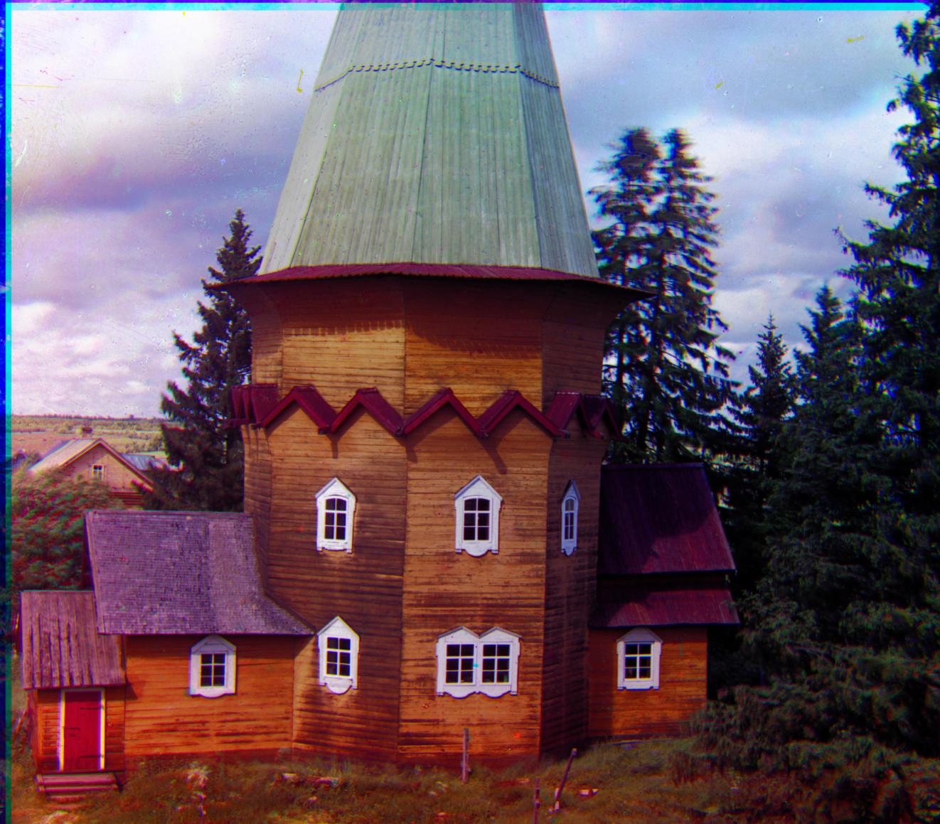
Very saturated colors in addition to contrast. This makes the wood look damp. |
House

R[28 23 1.0035 1.0070 -0.0320] Better alignment and sharpness on the house edges. Notice the roof edges, doorway, and windows on the bottom left corner. |
|
Closet

Already a good image, gives the impression that it was taken indoors with a fairly modern camera. Decent colors. |
Closet
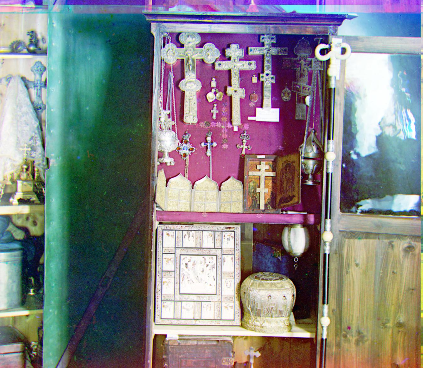
Very bright and washed out colors, likely due to overcompensating for blues once again. |
Closet
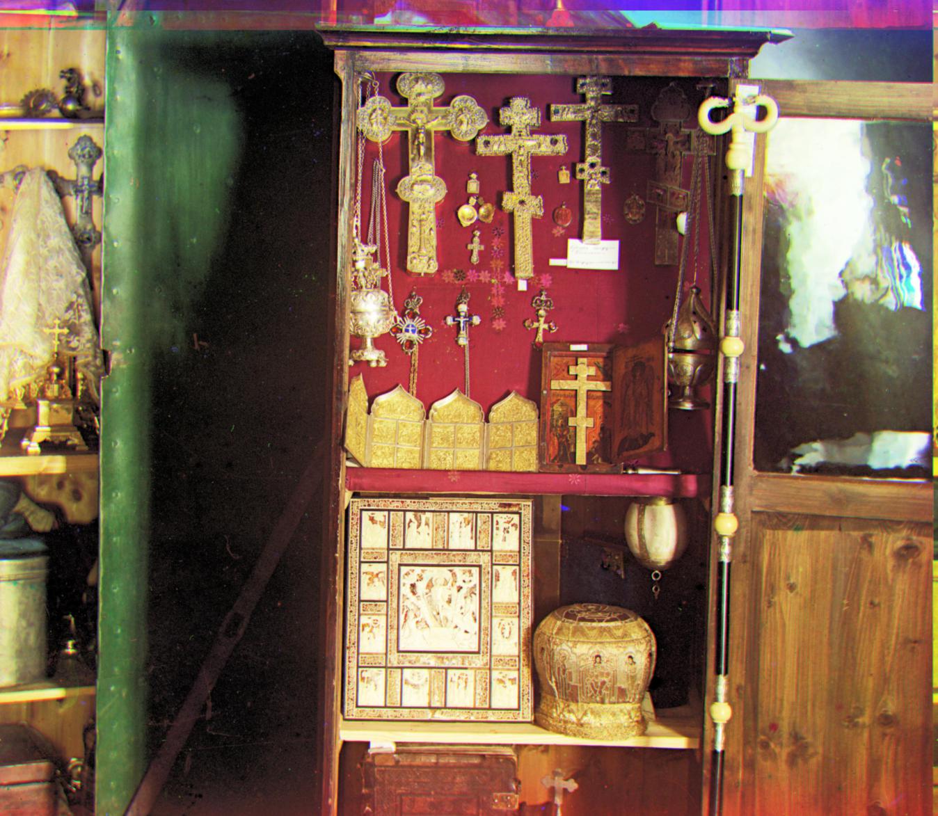
Fairly realstic shadows and contrast for an indoor image. |
Closet
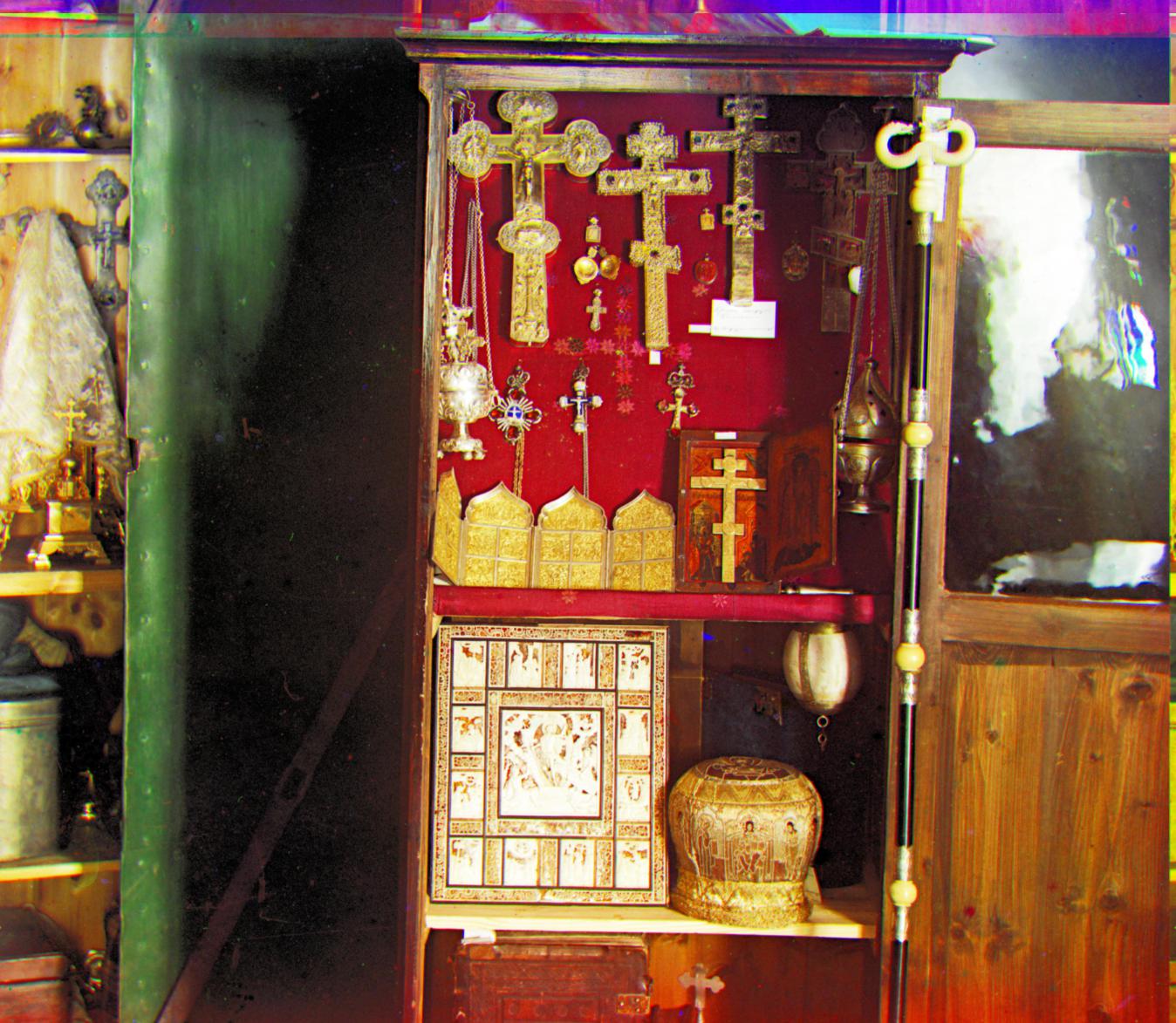
Good contrast and saturation. Saturation borderlines on being unrealistic, but is still pretty good. |
Closet

R[100 -16 1.0029 1.0029 -0.0445] About the same as the original, which was already fairly well aligned. |
